Time and Date: The Critical Icons You Need to Design Efficient Interfaces
In the world of digital design, where every pixel and interaction matters, the representation of time and date is more than just a functional element. It is a fundamental piece of visual communication that guides users through schedules, deadlines, reminders, and timelines. When these concepts are depicted poorly or inconsistently, the entire user experience can suffer from confusion and inefficiency. A well-crafted set of icons dedicated to time and date can transform a clunky interface into a clear, intuitive, and professional one. For creators building mobile apps, websites, or presentations, these icons are not mere decorations; they are essential tools for effective information architecture.
The Overlooked Importance of Temporal Icons
Many designers, especially those new to the field, treat icons as a final decorative step. They might grab a generic calendar or clock icon from a massive, unfocused pack, thinking the job is done. This is a common oversight. Time and date icons serve a specific semantic purpose. They need to be instantly recognizable and culturally appropriate. A mistake here isn't just aesthetic; it affects usability. For instance, using a linear, minimalist clock icon in an app for elderly users who might prefer more traditional, detailed imagery could lead to missed appointments. The icon fails in its primary job: clear, unambiguous communication.
Another frequent misunderstanding is assuming one icon fits all contexts. The concept of "date" could mean a calendar, a specific day marker, a deadline flag, or a historical timestamp. Using the same icon for all these scenarios forces the user to rely solely on accompanying text, overloading the cognitive load. A specialized set, like one offering distinct icons for a calendar, a clock, an hourglass, and a timeline marker, allows for precise visual shorthand. This enables designers to create more efficient layouts where the icon carries significant meaning, reducing textual clutter.
Common Pitfalls in Selection and Application
Let's walk through some realistic scenarios where poor choices with time and date icons create problems, and how a thoughtful approach solves them.
Mistake 1: Ignoring File Format and Style Cohesion
A blogger creating an infographic about project milestones downloads a random PNG icon of a clock. Later, they need to scale it up for a presentation slide, and the pixelated, blurry result undermines their professional credibility. Meanwhile, their website uses sleek line icons, making the bulky, filled-style clock look out of place. The disjointed visual language makes the content feel less trustworthy.
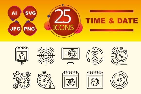
The Better Approach: Always acquire icons in a vector format like SVG or AI, alongside raster formats like PNG and JPG. Vector files are infinitely scalable, guaranteeing crisp quality in any size from a mobile app button to a large presentation screen. Furthermore, insist on a consistent style. A dedicated time and date set in a clean Line Icon style ensures every temporal element—from a calendar to a schedule icon—feels part of a unified family. This cohesion strengthens your brand's visual identity across all mediums.
Mistake 2: Underestimating the Scope of a Minimal Set
An entrepreneur building a simple booking website thinks, "I just need a calendar icon." They purchase a huge, expensive library with hundreds of icons, wasting time searching and money on irrelevant graphics. During development, they realize they also need an icon for "duration" and "start time," which their purchased pack may not cover well, leading to a makeshift, inconsistent solution.
The Better Approach: Evaluate the scope of your project practically. A focused set of 10 core time and date icons often covers the vast majority of needs: calendar, clock, alarm, hourglass, timeline, stopwatch, date marker, schedule, past, future. This targeted collection is easier to manage, applies consistently, and is more cost-effective. Before buying, check the exact list. Does it have the specific temporal concepts your project requires? A small, well-curated set is usually more valuable than a sprawling, generic one.
Mistake 3: Neglecting Integration and Accessibility
A developer quickly inserts SVG icons into an app without proper labeling or considering color contrast. For a user with visual impairments relying on a screen reader, the icon is meaningless without alternative text. Similarly, using a thin line icon on a busy background makes it vanish, failing its communicative purpose.
The Practical Advice: Technical implementation is part of the design decision. When using these icons, always provide descriptive alt text (e.g., "calendar icon for booking") for accessibility. Ensure the line weight and color of the Line Icons contrast sufficiently with their background. Test them in real interface conditions—on a bright screen, in dim light, on a small mobile display. An icon is only helpful if it is perceivable.
What to Check Before You Decide
Choosing the right time and date icon set requires a few mindful checks. First, examine the file types. Are the formats provided (AI, JPG, PNG, SVG) compatible with your software and all your intended use cases? Second, audit the style. Do the line icons match or complement the existing visual tone of your projects? Third, review the specific 10-icon list. Does it cover the temporal actions and concepts you need to express? Missing a key icon like "timeline" might force you into a compromise later.
Finally, think about longevity. A timeless, clean line icon style will remain usable and modern through design trends, whereas overly stylized icons might feel dated quickly. This set is a tool for communication, not a trend piece. By focusing on clarity, consistency, and technical quality, you avoid the common mistakes that lead to confusing interfaces and frustrated users. The right icons empower you to design systems where time is not just displayed, but understood.